What We Do
Responsive Design + User Interface
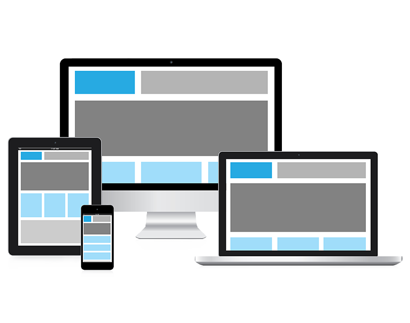
Social, desktop, tablet, mobile. Cross platform. Cross screen. Across town.
New ways to architect and build best websites, software, data, technical & content solutions across multiple screens.
Today’s Internet defies definition and constraint. The new web is complex, and increasingly devices & browsers hold more options and technical constraints than ever before. With viewports getting smaller and larger simultaneously, these days we design to incorporate technologies from mobile browsers to netbooks and tablets, and users are visiting sites, often progressively, from an increasing array of devices and browsers.
Responsive web design is a technique and new design approach that helps websites & content to scale and present an optimal viewing experience—easy reading and navigation with a minimum of resizing, panning, and scrolling—across a wide range of devices & browsers (from desktop computer monitors to mobile phones). Today’s designs & technical capabilities must anticipate and respond to the end users’ needs, on any device. A responsive (RWD) site adapts the layout to the viewing environment by using fluid, proportion-based grids, flexible images, and CSS3 media queries for fast load across multiple formats according to the @media rules.
- user preference design across multiple screens
- mobile + tablet + laptop + desktop development
- ubiquitous, intelligent, semantic, cross platform
- static + dynamic content across multiple sites + platforms
- relevant content/data to multiple customer segments
- build, manage, + publish content to multiple screens
- customizable content management
- linked data across multiple screens
- aggregate social information across multiple networks
- run + manage multiple simultaneous campaigns
- multi language translation
- transparent shared, secure, and scalable infrastructure
- marketing, customer acquisition + cross website strategies
- app development
- social enterprise/social business conversations
- CRM integration
- cloud based options